

During Self Portrait Week, I had to design a simple icon of my face that accurately represented who I am and matched the offered comparative photos. The self portrait was made in Adobe Illustrator using a Landscape Print A4 art board and the RGB colour mode. Throughout the design process, guidelines (8 rows and 8 columns) were employed. I used the paint brush tool, 1 pt. flat, with the parameters set to angle 0, roundness 100%, size 5pt, and fill colour black after placing the image of myself on the artboard. I discovered that the details of the paintbrush matched the lines on the comparison photograph. The circle behind the face symbol was then made using the eclipse tool. I filled the circle with yellow because it is my favourite colour and best describes who I am as a person.


For Logo Design Week, it revolved around a young tech entrepreneur who requested that a logo be created for their business. The business owner has requested that the logo be influenced by Aboriginal and Torres Strait Islander culture while being careful to be culturally suitable. The firm name (WAVE) and a symbol or other supporting visual element must also be included in the logo. The RGB colour mode and a Landscape Print A4 art board were used to create the logo in Adobe Illustrator. It was crucial to find common elements as the client offered these as reference photographs. When examining the images provided as a guide, the use of just two colours, the corporate logo, and pastel colouring stand out. The design method made use of guidelines (8 rows and 8 columns). The paint brush tool (1 pt. flat, with the parameters set to angle 0, roundness 100%, size 5pt, and fill colour yellow) was used to design the wave. The text tool (using a font that matched the colour of the wave, Source Code Variable, semi bold), along with the rectangle tool, was used to create the background.


This week's task was to create an A5 event poster for Hello Furniture Co. A community event is coming up, and Hello Furniture Co. has requested a design for an event poster. The client has provided a Pinterest reference image that should be used as a model for their event poster. Since the client has not paid for licencing, they do not have rights to use intellectual property, thus images have been sourced. This poster required the use of Adobe Illustrator and Adobe InDesign. The client has specified key elements that the poster must have. First, the doodle was created on an A4 landscape print Adobe Illustrator art board using the RGB colour mode. I used the paint brush tool, 1 pt. flat, with the parameters set to angle 0, roundness 100%, size 5pt, and fill colour black to create a person wearing a zebra mask on the artboard. The poster was then made on Adobe InDesign utilising an A5 Portrait Print art board and the RGB colour mode. Eight rows and eight columns of guidelines were used in the design technique. The text tool (American Typewriter font and Acumin Variable Concept, colours yellow, black, and white) was utilised. The text and doodle were positioned using one of the examples provided, and they were set up to resemble the reference image.


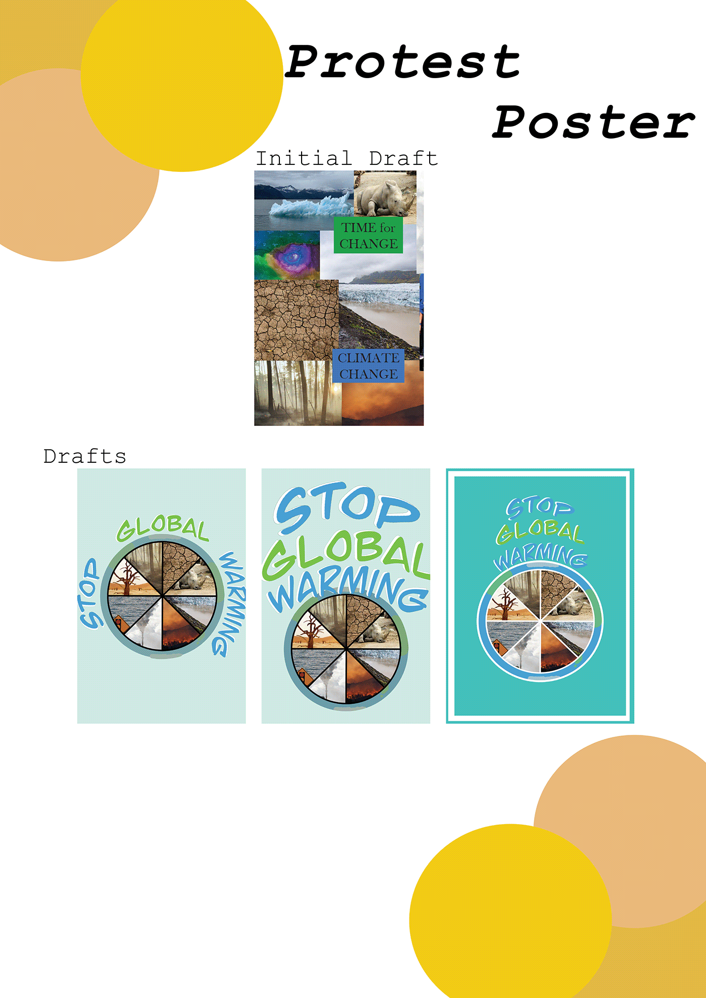
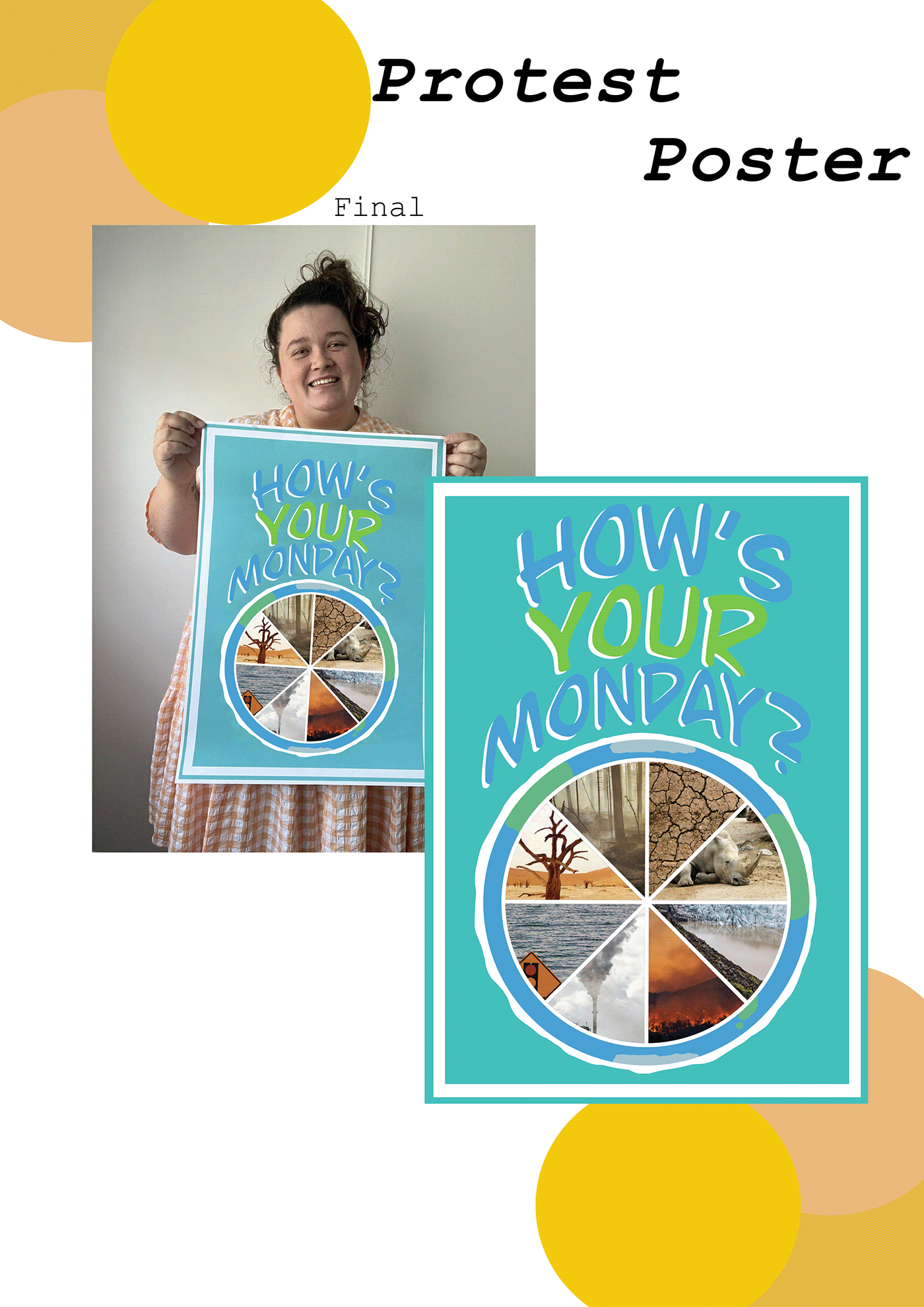
This week's task was to design a large-format protest poster. The large format protest poster's main message was "free choice on an issue that is important to me." The 'earth' graphic and the poster's text were created using an A4 portrait print Adobe Illustrator art board and the RGB colour option. These were created using the paintbrush, eclipse, and line segment tools. The final design was produced in InDesign utilising the RGB colour mode to create an A2 portrait print art board. Eight rows and eight columns of guidelines were used in the design technique. Rectangle tool and inserting Illustrator pictures were the methods used to design the poster.

The task for this week was to use Adobe Photoshop to create a surreal composite image. One of the photographs from the supplied set should be used as the background, and the other as the "hero" or person. Shadowing, scale, and perspective must all be used effectively if the finished image is to appear virtually real. using the RGB colour option on an A4 landscape print art board in Adobe Photoshop. A selection tool, refinement tools (feather and smooth), a paint brush, an eraser, blending options, adjustment tools (exposure and brightness), and effects (drop shadow) were all employed throughout.


The task for this week was to use Adobe InDesign to alter the provided document, The Gender Pay Gap by Age Group (June 2022). This document was produced using Adobe InDesign and an A4 Portrait Print art board in RGB colour mode. Eight rows and eight columns of guidelines were used in the design technique. The text tool (font - Adobe Hebrew, border - 4pt, inverse rounded, yellow) and picture placement (border - 4pt, inverse rounded, yellow) were utilised throughout this project.


This week's assignment is based on a novel perfume brand that requested some fundamental photography ideas. The business is renowned for its distinctive blends of scents that are inspired by commonplace products. The pictures must be placed similarly to the examples using Adobe Photoshop A4 portrait print art board and the RGB colour mode. A selection tool, refinement tools (feather and smooth), a paint brush, an eraser, blending options, adjustment tools (exposure and brightness), and effects (drop shadow) were all employed throughout.


Create your own Behance profile, folio with the previous week's tasks and reflection for this week's assignment. Using the RGB colour mode in Indesign, make an A4 portrait and landscape print art board for your behance folio. The eclipse tool, text tool, and inserting the photos from earlier jobs were the tools used to design the poster.


